Statement of Intent
For my website I am trying to base it around textures to show the unique patterns of objects, I am also trying to evolve and expand my knowledge and ideas on my theme along with drafting back and reflecting on creative ideas that will benefit me in the future. I intend to present this by showing the dedication that I am going put in to my work, taking time to create a website with creating and engaging ideas in my future writing and photographs. Showing my best and worst images definitely make me realise that even if the picture is not up to high standard that I prefer I can go back and reflect on where I went wrong which allows me to evaluate on further progress. Presenting my worst and best images in a gallery is how I will show my work.
Researching photographers and studying about how they work, their techniques is actually a crucial and beneficial part in photography. I am going to research on a few photographers to increase and develop my progress in photography. The photographers that I am going to study are: Roe Ethridge, Imogen Cunningham and Harold Feinstein. These proffesional photographers have allowed me to see the techniques that will be helpful to me in further progress. Also where they get their ideas from is a big inspiration for me to try the different themes they use. From their work I hope to learn the methodology, layout, strategy, route and scheme. From Roe Ethridge I hope to learn how to strategically shoot images of objects and have a reason or origin for the image. For example his image about the quote “C’est pas du luxe” is the meaning for the image and what its about, therefore his image has a backstory. What I have learnt from Imogen Cunningham is how she strategically shoots objects in her own unique way. My favourite theme that she uses for her photos are the way she develops her black and white images, they are simple but the way they are structured really make the subject, From Harold Fienstein I want to learn the method of his simple still life images taken with objects.
When I go through this theme I think that I will really enjoy it, seeing and analysing the different textures of objects. Whether they are man-made or natural textures. Alternating through different settings, lens', editing, gets really enjoyable and allows you to see the details of basic objects which in my opinion is fascinating! After thoroughly researching on photographic techniques and photographers It has really expanded my ideas and photography methods. Like using a mirroring technique, ambient lighting, nature shots. etc. Using Photoshop/Photopea will be a good way for me to mess around, experiment and express my ideas.
For a starting point to show my progression on textures I am going to get started with Fruit and Vegetables, flowers, trees plants. Really trying to use a lot of nature and green life in the images. After all photos were taken I used Photopea to edit them and try different varieties of editing methods to edit them. For example I am going to try black & white, contrasting, brightness and vibrance, hue and saturation. I am then going to try do the same thing for the man-made structures. Taking photos of metals, rust, pipes, drains, gates etc.
The correct equipment is also very important in photography to be able to get the right pictures that fit your standards and preferences. The cameras that I will be using are the Sony Canon 600d and the Sony Canon 1200d (both manual DSLR's) . For this texture project I will alternate through different lenses to really get to be able to see the deeper details of objects with the naked eye. I will switch between my normal lens and a macro lens! For the first part of this texture project I am going to be using my phone for a easy start to this theme. But the higher quality and resolution really makes it enjoyable to see the end result and really be proud of them. In photoshop I will use brightness and contrast, vibrance and saturation, curves, exposure etc. One thing that I would really like to try to do in photoshop is the floating object technique, photographers use this to make a person look like they are floating or even an object.
I have several months to produce my website, I have to confide
to do my best to provide a good website. I am aiming to complete my research on all three photographers in around 3-4 weeks or less which will allow me to be able to see the progress develop. Hopefully near to the end of my research I will have gained all the knowledge I will need to know. Trying new, different ideas in photoshop and photopea give me hints and ideas of the new picture methods I can try to do. Enhancing images in photoshop give me subtle reminders to see if I can try to take them without editing. For my final portfolio of work I will display my evaluations of the pictures take and my best and worst outcomes.
As I continue to finish my project I will show annotations, evaluations and explanations which labels almost everything in my website so that they are shown clearly. This also shows that I understand the progress and each step of my work. I have show my journey of progression by providing my best and worst outcomes also along with all the other subjects I have done to increase my knowledge on my photography journey. Getting support from my teacher really helps me understand where I can go right and wrong in my work which helps me understand the mistakes so they are not done again. Evaluating on my project is also like reflecting on how I am doing my work.
Research
Photography research of Roe Ethridge

Content
This picture is about the quote “C’est pas du luxe” by Roe Ethridge phrase means to have so much, that it is wasted. The picture contains two apples, one of the apples which half of it is cut up into pieces. On the pieces of apple there are wasps eating the apples. It is also a still life picture. The wasps can not eat two full apples so eventually the apples will go to waste which links to the quote/name of the photograph. This is a realistic photo as it also has life and greenery shown in the background maybe to show more vibrance in the picture. This is also a shallow photograph with an interesting depth of field. This gives an effect on the photograph for it to be able to have an out of focus effect. Since the background is green and a variety of plants the colours show and make the colour on the apples stand more. Red and green are opposite colours, they are complementary colours and are complete opposites of each other! The high contrast on both of these colours show the saturation and vibrance very well. The title on the picture can change the way people think about the picture when they understand the context of the quote and how it evaluates the photograph. In my opinion the theme on his photograph is how people want so much until they have had enough for it to eventually go to waste, We can't always have so much and too little.
Context
The picture was taken in 1979 by Roe Ethridge. The picture is published in his book, Le Luxe, that shows all his work over the past years. Ethridge worked from November 2005 to January 2010. He was born in 1969 and got a BFA in Photography at The College Of Arts in Atlanta, GA. This picture was viewed by the public and was shown for anyone to see. The picture elucidates and illustrates greed and want due to the six wasps eating the apples that they will eventually have too much and will have to stop. The food is going to waste and will not be able to be eaten. So much is wanted, until so much is wasted.
Composition
In this photograph there have been lots of rules used to give the picture a natural and clear look. The Central Focal point has also been used in this picture to give the photograph a separate detail on each side of the photo. The first thing our eyes are drawn to when we see the picture are the apples and then the wasps along with the smaller pieces. The position of the apples are positioned in the centre but are seen in different ways due to the way it is seen. However, the apples also look off centre because of the way they are facing. This leads us to the symmetry on the photo that gives a balanced look due to the horizontal guide lines of the way the apple is facing and has been cut. A studio light has been used on the apples to give a more glossy and shiny effect on them. This over exaggerates the and gives a drastic shadow on the apple to make the shadow look bold. Proportion is comparing sizes of an object to another. So therefore the proportion being used in this photograph is the size comparison between the apples and the wasps. Proportion can also be included when talking about the comparison in frequency and amounts. For example in Roe’s Photograph the amount of apple pieces compared to the tiny wasps eating the apple. It is too much for the wasps to consume. The scale to size is how big the Apples are. Spatial recognition and variety of depth are the main elements of a perspective. It is based on how you see the picture and the angle it is taken on. Roe’s picture was taken from the centre so the picture can settle a more balanced effect. It also lets the studio light cast an exaggerated and drastic shadow. So the apples and the wasps are the centre of attention and catches your eye when the photograph is first viewed. The Foreground in this picture is the visuality of the wasps and the little slices of apples, the apples and wasps are closer to the viewer. The background also really brings colour into the photograph, the perceived furthest subject. In the middle ground the sliced apples are positioned. The ISO on the photo isn't very high or very low so it looks like it is set to around 800. The white balance also looks very warm so it might be set to Sunny or Shade. The f-stop is around f/2 or f/2.8 or a f/1.4. Because the photograph has an out of focused background, therefore the depth of field is shallow.
Comment
I am not so sure about wether I like Roe's work although I do like his methods and techniques he uses to perform the art of his works. He uses focal points in the ln photographs like for example how he has used the bees and apples as eye catchers. He also frames his photographs when he zooms in.
Photography research of Imogen Cunningham


Context
I have researched information about Imogen Cunningham from the internet :
AMERICAN, 1883 - 1976 )
"Imogen Cunningham occupies a singular position in the history of American art of the twentieth century. For over half the history of photography, she explored- with innovation and a new perspective- all the major traditions associated with the medium as fine art. She has been most widely acclaimed for the photographs made during the 1920s and 1930s, particularly close-up images of plants and nudes. She also made portraits which are now considered classics in photography, including images of Alfred Stieglitz, Spencer Tracy, and Martha Graham. She was a founding member of the West Coast-based Group f.64, which championed an un-manipulated, direct approach with the camera, or “straight” photography. Her photographs are represented in major collections and museums around the world. The Weston Gallery represents the Imogen Cunningham Trust and have vintage, modern as well as posthumous prints available. Please contact us for acquisitions."
I have researched from this website : https://www.westongallery.com/original-works-by/imogen-cunningham
Composition
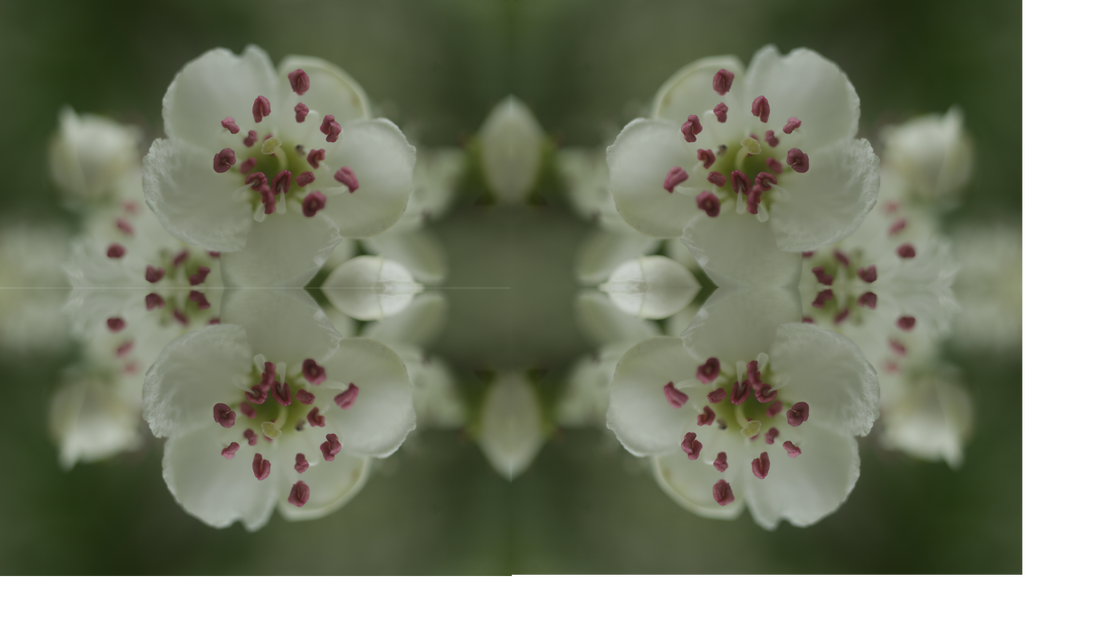
The light on the image is almost like the focal point of the image since the background is black. This gives us a monochrome type of image. The light is shone directly on the flowers either directly opposite or positioned about the flowers pointing down. This is so that a darker contrast is based. Artificial lighting also known as studio lights are used to give a lot of brightness to the images so that the lighting is not dim, making it also look more proffesional. But it could also be used to exaggerate shadows to give a more vibrant look on the object. The rule of thirds is when the screen is split into 3x3 lines horizontally to cause a focal point for the image also giving symmetrical and even proportions and positions of object . Imogen Cunningham used the rule of thirds here to get even proportions of the flower into frame. The contrast used in this image really helps the colour on the on the flower show out from the background making the edges and curves on the flower look sharp and clear. Even though the image is in black and white, the contrast still gives a huge effect on the image turning the flower into the focal point of the image departing it from the dark background. Studio shot is when equipment is used to perfect the image on its framing, lighting, distance, backgrounds and more. Imogen Cunningham uses a plain black background in most of her images instead of natural backgrounds.
Content
This picture is about the flowers that imogen shoots. She uses black backgrounds and bright bright vibrant flowers and then edits them into black and white. She uses a studio light on the flowers so that when they are edited into black and white they come out light and white coloured, this also gives the flowers a luminance and contrast effect. The flowers have a lot of grooves and deep corners which is actually very good for black and white images because it exaggerates the black/darkness in the flowers fading inside away from the light. These are still life images, they have nothing to cancel them out in the back which makes them stand out even more. These images are also realistic and not abstract, they do not have any unusual or out of place objects placed in frame. The flowers somewhat have a high contrast around them.
Comment
I really like how Imogen frames and preforms her photographs. The the contrasted, black and white theme that she uses on the flowers exaggerate the shadows. The curves of the inside edges produce a ombre effect, gradually going from black to white. Her technique of using a black/dark background to disport the brightness of the flower that it illuminates almost like the light is reflecting of the flowers.
I have researched information about Imogen Cunningham from the internet :
AMERICAN, 1883 - 1976 )
"Imogen Cunningham occupies a singular position in the history of American art of the twentieth century. For over half the history of photography, she explored- with innovation and a new perspective- all the major traditions associated with the medium as fine art. She has been most widely acclaimed for the photographs made during the 1920s and 1930s, particularly close-up images of plants and nudes. She also made portraits which are now considered classics in photography, including images of Alfred Stieglitz, Spencer Tracy, and Martha Graham. She was a founding member of the West Coast-based Group f.64, which championed an un-manipulated, direct approach with the camera, or “straight” photography. Her photographs are represented in major collections and museums around the world. The Weston Gallery represents the Imogen Cunningham Trust and have vintage, modern as well as posthumous prints available. Please contact us for acquisitions."
I have researched from this website : https://www.westongallery.com/original-works-by/imogen-cunningham
Composition
The light on the image is almost like the focal point of the image since the background is black. This gives us a monochrome type of image. The light is shone directly on the flowers either directly opposite or positioned about the flowers pointing down. This is so that a darker contrast is based. Artificial lighting also known as studio lights are used to give a lot of brightness to the images so that the lighting is not dim, making it also look more proffesional. But it could also be used to exaggerate shadows to give a more vibrant look on the object. The rule of thirds is when the screen is split into 3x3 lines horizontally to cause a focal point for the image also giving symmetrical and even proportions and positions of object . Imogen Cunningham used the rule of thirds here to get even proportions of the flower into frame. The contrast used in this image really helps the colour on the on the flower show out from the background making the edges and curves on the flower look sharp and clear. Even though the image is in black and white, the contrast still gives a huge effect on the image turning the flower into the focal point of the image departing it from the dark background. Studio shot is when equipment is used to perfect the image on its framing, lighting, distance, backgrounds and more. Imogen Cunningham uses a plain black background in most of her images instead of natural backgrounds.
Content
This picture is about the flowers that imogen shoots. She uses black backgrounds and bright bright vibrant flowers and then edits them into black and white. She uses a studio light on the flowers so that when they are edited into black and white they come out light and white coloured, this also gives the flowers a luminance and contrast effect. The flowers have a lot of grooves and deep corners which is actually very good for black and white images because it exaggerates the black/darkness in the flowers fading inside away from the light. These are still life images, they have nothing to cancel them out in the back which makes them stand out even more. These images are also realistic and not abstract, they do not have any unusual or out of place objects placed in frame. The flowers somewhat have a high contrast around them.
Comment
I really like how Imogen frames and preforms her photographs. The the contrasted, black and white theme that she uses on the flowers exaggerate the shadows. The curves of the inside edges produce a ombre effect, gradually going from black to white. Her technique of using a black/dark background to disport the brightness of the flower that it illuminates almost like the light is reflecting of the flowers.
Photography research on Harold Feinstein
Content
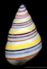
This picture is of a bright coloured Rainbow Tree Snail. The vibrant spiral patterns on the shell divulge and expose the colours and really brings them out. This picture is a still life photograph and is positioned with a plane background to still have the shells natural look and not cancelled out by anything in the back. The picture is also realistic and not abstract, it doesn't have any unusual or out of place patterns, this is more of a symmetrical pattern. The colours that have been used are Pink, Purple, Blue, Orange, Yellow and Maroon. These are very radiant and scintillating colours! The theme of his photographs are natural objects like Flowers, Plants, Fruit and Vegetables. This specific theme is shells and a lot of lively bright colours.
Context
This picture was taken in 2004 and taken by Harold Feinstein. The work was presented and then viewed by the General Public. He was born on Coney Island 1931 and died in June, 2015. He started his Photography arts work at the age 15 and 1946. The New York Times presented him as “One of the most accomplished recorders of the American experience.”. Harold had his first exhibition at the museum of Modern Art, International Centre of Photography. He became a prominent and popular photographer and figure of the original inhabitants of the legendary “jazz loft”. He was also the designer for Blue Note Records.
Composition
There are many rules of composition that Harold used in this picture. For example Rule of Thirds, Rule of Even, Symmetry and Patterns etc. In his pictures he uses a black background when shooting objects like flowers or shells. This is so that nothing in the background catches the eye since the flowers or shells are the focal point of the image, anything colourful or interesting would cancel the beauty of the object that is meant to be the main subject of the image. A dark background can also be used to sharpen the edges of the objects making it look like it has a higher resolution. Feinstein does not really shoot his photographs outside, he uses a backdrop with studio/ambient lighting. His images are usually bright, clear and vibrant. His images are not noisy either which tells us that his ISO could be low, maybe around 100-400. The white balance also looks like it could be set to Auto or Fluorescent.
Connection
I will use this research in my work because I like shooting simple objects by themselves on a background that really brings out the colours on the object. Using the same techniques and settings will really help. Maybe the way he proportions and frames his objects and images too.
Mood Board


For my natural textures I will be taking photographs of nature such as trees, flowers, leaves, snow etc. Going out to take pictures in different seasons will really give me and idea of how to display scenery in different ways. Also going out to take photographs of a different variety of flowers and textures which in my opinion is one of the most enjoyable things about this project. This mood board gives me an idea and inspiration on how my photographs should be take and compared to. My photographs will be compared to my mood board to see if they fit a good standard of my liking.
The last two galleries on this mood board are about man made textures and the high details of materials like metal or silver. Taking photographs of different materials like in the photographs above in my mood board. These on my mood board are so I can see what what my photographs could or should like, the mood board gives me and idea of how I should take pictures of metals.
The last two galleries on this mood board are about man made textures and the high details of materials like metal or silver. Taking photographs of different materials like in the photographs above in my mood board. These on my mood board are so I can see what what my photographs could or should like, the mood board gives me and idea of how I should take pictures of metals.
Mind Map

Shoot Plan
The theme for my project will be about texures and the different varieties of texture. Looking at natural textures like flowers, plants and trees are the main subject of natural textures I am trying to base around. The props I will need are flowers or plants. I could use a tripod to get slow motion shots of flowers or I could just use it to take pictures with a fixed frame. I will be taking pictures of flowers in-door and out-door, this gives me the option of different backgrounds. Using the sky as a background can also change the setting, mood and atmospheric attention of the photograph. Choosing the colour of my background could also be done inside for studio shots. If I am taking my photographs inside I with an ambient light above so that I can get contrasted photographs. Going outside for my natural flower shots is beneficial and also having to do it in the afternoon to get a bright coloured sky. For my out-door shots I have a preference of bright coloured flowers. However, I love the effect of dark contrasted looks on the flowers with a dark background. My camera setting will be set to mostly auto and a mix of manual.


Best image
This is best image because it has a shallow depth of field, making the front of the corn out of focus and making the corn on the bottom clear and in focus. The lighting staged from behind the corn really brings out the shadows from the shadows from the front also giving a luminous vibrance on the corn in the back. There are very subtle adjustments of contrast in the corners of the corn at the top and bottom, just to give a darker look to exaggerate shadows from the studio light.
|
Worst image
In my opinion this is my worst image. This is because of the proposition of the corn, the corn is not placed in a way that would give a good quality effect. The backdrop is also not placed properly, the bottom of the image can be seen and throws off the backdrop, ruining the image. They are not in frame properly which causes them to become out of focus.
|
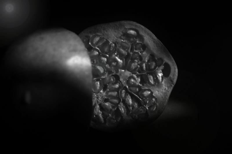
Pomegranate


Best Image |
Worst image |

I think that this is my best image Because of the way that the pomegranate is propped. The lighting is almost perfect due to the sunlight setting just above the fruit, shining down from the top to give it the perfect position for it to look like a studio light was used. Everything is in frame and and placed right. The contrast on the image makes the background dark enough to make the exposure on the pomegranate not over exposed. The dynamic range on the image is not so dark but not so bright either so I would say it was about -2 stops or 0.
|

This is my worst image. I think that this is my worst image because the background is still visible which was not my intention for the image. Also the pomegranate in the back could of been shown a little more. The lighting is not so bad but, however it does get quite dark in the back. The exposure compensation could of been handled a bit more, adjusting the brightness and darkness a little more.
|
Apples
|
|
|


Best Image |
Worst image |

My best image on shooting the apples is this one. Instead of using the auto white balance setting I wanted to try something different so instead I used the shade setting. This gave quite a yellow filter on the apples instead of giving it a blue or white effect. I also used the rule of thirds, propping the apples so that one apple sits on top of the others in the centre of the frame, this is also the main focal point.
|
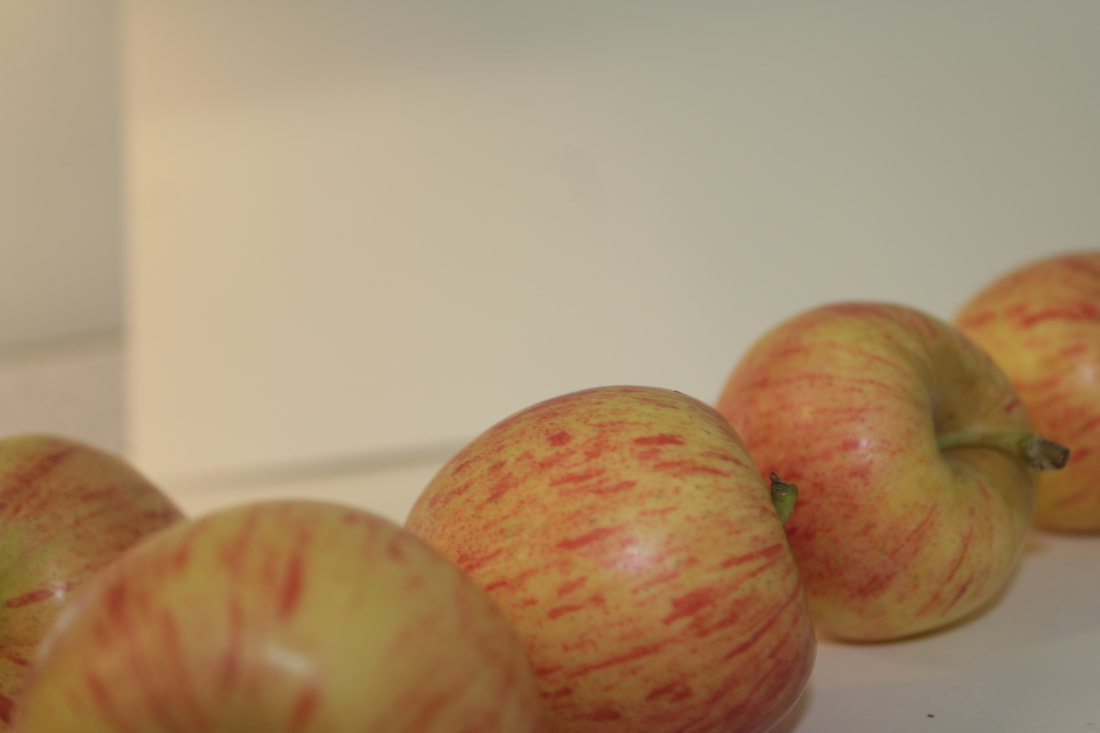
This is my worst image because it is too overexposed and the white balanced that I used was fluorescent. The background is also in frame. Exposure compensation in this image is set to 0 which is a little to ever exposed. The aperture and fstop is set to about f22 which in my opinion should be lowered.
|
Shells


Best image |
Worst image |

This image quite unique to me. This is one of my best images because of how close up it is which allows me to see all the smallest details on the shells. It isn't overexposed or underexposed either. The composition of the shells really put the image together too. The saturation isn't as high neither is the fstop. The ISO was set to 400 which made it so the image wasn't so bright. Lots of midtones between white and pink are also shown. I also used the rule of thirds, propping one shell in each square at the bottom of the image.
|

I think that this is my worst shell image, Because the glass beaker that the shells were in are visible in the image and sort of get in the way at the front of the image. The focal point could have also focused on the shells a little bit closer. I macro lens would have been great for the shells since they have very different varieties of texture on them. The exposure compensation is also set to about +0.7, I would prefer if it was set to 0.0.
|
Grapefruit


Best image |
Worst image |

The acutance on the photograph is very defined which in my opinion is very preferred! Ambient/studio light was used to give the grapefruit a glow from the top and amplifying or exaggerating the shadows underneath the fruit and on the opposite side of the grapefruit. Edges and corners are sharp making the background look separated even if it is a dark, blurred background. The vibrance and saturation work really well and effectively on the colours in the image, for example the bright orange colour fades perfectly to the dark sided part of the image where no light is shown. All the small details and textures in the skin of the grapefruit
|

The background in this image was very visible which ruined the whole image. I could have also changed ISO, this would have decreased the noise on the image. It could have also been a little better if there was an ambient lighting instead of a studio light, but the lighting is still effective it just draws the illumination. The edges of the grapefruit are not as sharp as I wanted them to be, this would have made the grapefruit stand out from the background a little more.
|
Cabbage


Best image |
Worst image |

This is my best picture because nearly all my camera settings and adjustments set up correctly so get the the dark and contrasted effect! The studio reflects on the cabbage closest to the camera, making the background darker. Since the camera is so close to the cabbage and a little zoomed in the smallest details on the cabbage are able to be seen by the naked dye even better. The lighting is quite drastic on the right to left of the cabbage which in my opinion is a really nice subtle effect when shooting objects in photography.
|

In this image you can visualise that I attempted a close up on the cabbage to get really a shot of the texture and textures. It is a little to bright for my liking but not overexposed. The ISO could have been lowered to reduce the noise and the slight fuzziness from the accidental camera movement. Also, if I was going for a close up picture it could have been a lot closer. The background is a little to bright for my preference too.
|
Developing my ideas using Black & White adjustments in Photopea.
Original picture


Final Image
|
I have produced and developed my images using the Black & White filter adjustments . I also altered the contrast, brightness for a greater vibrance and saturation. I have also used the render filter to bring out a lens flare to give the effect of direct light coming from the left hand corner. Using the 'curves' adjustment I was able to make certain parts of the image brighter than other parts to make it look like the light is only hitting one spot. This helps exaggerate the shadows on the image.
In my opinion I think I have improved it by giving the image a dark focal object which sort of increases the visibility of the shadows behind the fruit. |
Developing my pictures using brightness and darkness varieties.
Original image


Final image
|
For this image no drastic or extreme editing was used. However, subtle changes to an image really do make a difference. For example for this image I have adjusted the the darkness in the picture to really bring out some colour in the background and also to exaggerate the shadows. I brightened the image to make the colour on the flower more vibrant so it becomes the focal point of the image, being able be an eye catcher.
|
Developing my pictures using Black and White filter in Photopea.
Original image


Final images |
To start off the first thing I did was contrast the image to make it look a little darker so that when I changed it to black and white it's not as white. This gives the wood a more oak feeling and just turns the colour a little more darker in range. I also decreased the brightness to -33. Then I went to 'Image, Adjustments, Black & White' changing the colour saturation a hue. This made the wood turn out dark enough to my preference. To finish off I used the curves adjustment to change the shadows and dark edges and corners.
|


Developing my pictures using colour balance and filter tools.
Original image

Final image |
For my final image on the flower the first thing I did was blur out the background and go over it a few times to make sure that it was all covered over. I did this because I wanted the flower to be the main focal point of the image and make it the first thing that catches your eye. After this I went to the Hue/saturation tab, I only made a little change and set the hue to 7. Then I went to curves and gave the colour on the flower a darker contrast so that the pink did not look so washed out. After this I changed the colour balances to : Red -22, Green 32, Blue -9.
|


Final Shoot Plan
My final shoot plan will be based on natural textures instead of man-made textures. I will be taking photographs of flowers, plants, and wood. I love the texture, curves, grooves and edges that natural objects are formed with. The vibrance of the flowers will go great with a monochrome or skyline background so that the colours of the flowers will suite with a blue sky in the back. I also want to do close ups of the flowers so that I can try to photograph the smallest details that are not so visible with the naked eye. I also want to try a stop motion of a dying plant or flower. Very shallow depth of field and out of focus photographs because I really love the outcome of how they are finished. Macro shots are really interesting to me and the being able to see how small things look so close up.
Snow Texture


Best Image
I think that this is the best photograph from this seperate gallery because of the angle it was taken at. The framing is good as it was styled to be zoomed in half-screen. The framing Idea of only keeping in half of the tree was an idea of mine to get the blue background to really stand out and form a hard outline of the snow and the tree leaves. The detail of the snow really gives an effect on the photograph because of the jagged edges with the sharp outline shape of the leaves. For this photograph I turned down the aperture in order to give a dark effect, the winter sky really has a cold, dark look.
|
Worst Image
This was the worst photograph that I had taken from this gallery as whole. The framing was not good as it captured people in the photograph. The framing could have also been a little more centered to the middle to give a symmetrical look. Zooming in a little more could have been better so that there would have been a higher resolution. The ISO could have also been tuned up.
|


Best Image
|

Worst Image
|


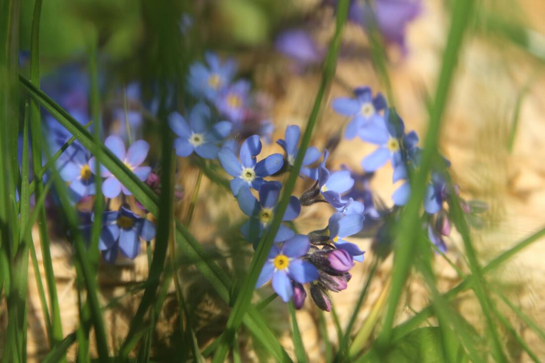
Natural Flowers


Best Image |
Worst Image |

|

|
|
In my opinion this is the best photograph from this section of flower shots. The flower is centered in the middle giving an effect of use of the Rule of Even. My ISO and Aperture settings were set correctly giving the right amount of colour, vibrance and light exposure. This is an example of shallow depth of field, meaning that the background on this image is blurred making the flower protrude and stand out. I was alternating through different white balance settings when taking these photographs because I wanted to experiment with different effects of like since the sun was out and the lighting was luminous and bright.
|
This was the worst photograph that I had taken overall. The ISO was not set when I was shooting. When taking this photograph I was using the Main dial to control the aperture, the aperture was set too low causing the photograph to look dark although it was in focus.
|
Propositioned and Framed Flowers


Best Image |
Worst Image |
I think that this was the best photograph that I had taken from this section. This close up was up to a good standard and really looked great. The grass overlays the flowers giving a close foreground. The grass is both out of focus and also in focus, the grass nearer to the left side of the frame are in focus and giving a clean, sharp look. The colours of the green and violet really blend together giving a sense of vibrance and exaggeration of colour formation. Yet again, this a photograph has a shallow depth of feild photograph, making the foreground subjects stand out and seperate from the background.
|

This is the worst picture from this section. The flower is not in great focus which makes the subject look dull and blurred. The colour mix with a yellow background and a purple flower was not a bad idea however it was set to a standard of my liking. The yellow looks washed out and dull.
|
Outdoor Shots


Best Image

|
Worst Image
|
Outdoor Shots


Shooting flowers in macro


Outdoor macro shots


Using Black and White in Photopea


Enhancing White balance in Photopea


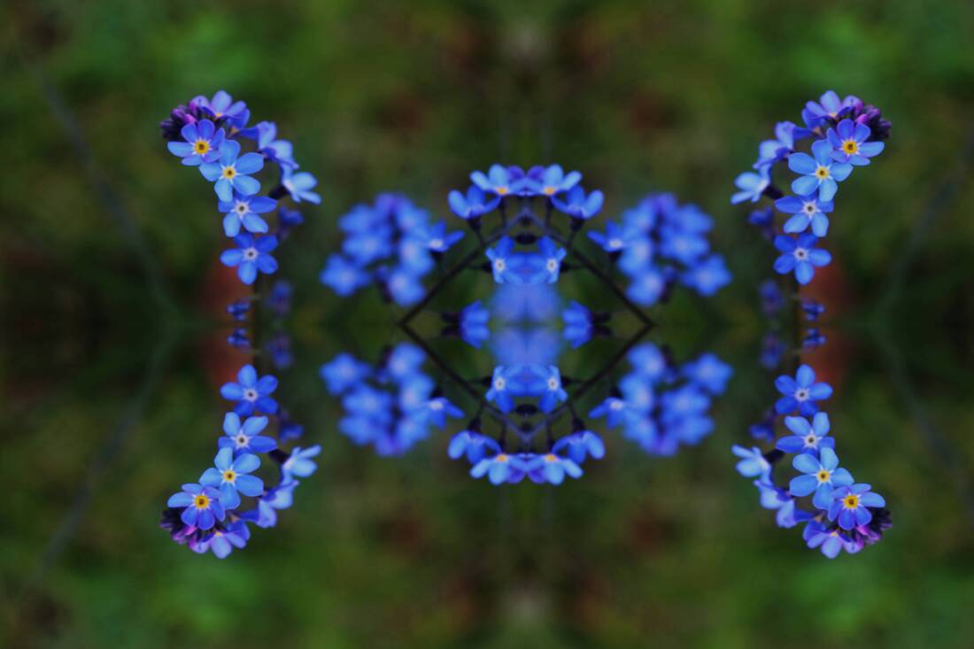
Using a mirror technique in Photopea


Using Black and White in photopea


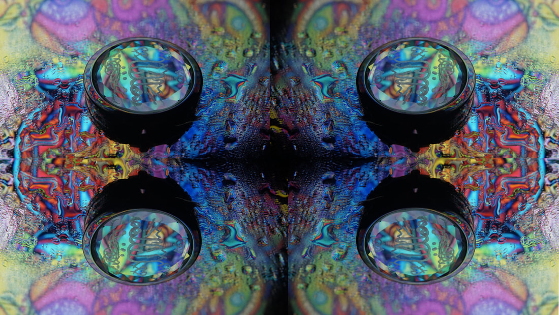


Final image

In this image I used brightness, curves and contrast as a main base setting. Firstly, I started of by slightly changing the brightness and contrast to make the colours of the bokeh really stand out a little more. Secondly, I moved on to the curves and adjusting the higher and lower tonal points of the image, highlighting the shadows and corner range areas. Then moving on to the vibrance and saturation. Using both of these I increased the density of the background bokeh and also the colours of the bottle at the front . Next, using a blur tool to block out the background with a more out of focus effect. Changing the colour balance to make different colours change in tonal range. Then changing to the exposure a little lighter to brighten up from the contrast. Lastly, I use the blur tool to just finish up and go over it again
|
|


My evaluation
My project theme was natural and man-made textures. Exploring and Experimenting the different ways of seeing textures from the naked eye from a different and closer perspective. In my opinion I enjoyed the theme because it enabled me to look at textures of basic and detailed objects differently. Taking close ups with the macro lens was very interesting but also a great challenge!
Overall, the project theme really let me try different angles, framings and other techniques without having an error.
The specific part of the project that I was most interested in was taking photographs using different settings, methods, modes to really develop my understanding of photography and the basic structure of it. I also enjoyed finding different ways to produce a photograph using Photoshop and Photopea. Using different camera settings when I am shooting photos opens up a new gate-way for my ideas of visuals.
I have learnt to reflect from my pictures and compare them to other photographers and their themes. My past research on Imogen Cunningham was a great inspiration for my black and white photographs, following up on her techniques of the dark, contrasted theme. My research on Harold Feinstien gave me the idea for simple and singular photography shoots of shells which I linked back to my photographs on textures of shells. Roe Ethridge gave me the idea of how to take photographs of fruit and their textures really close up.